An aesthetically contrasting design book aimed to break away from the usual style of typographic book available to students
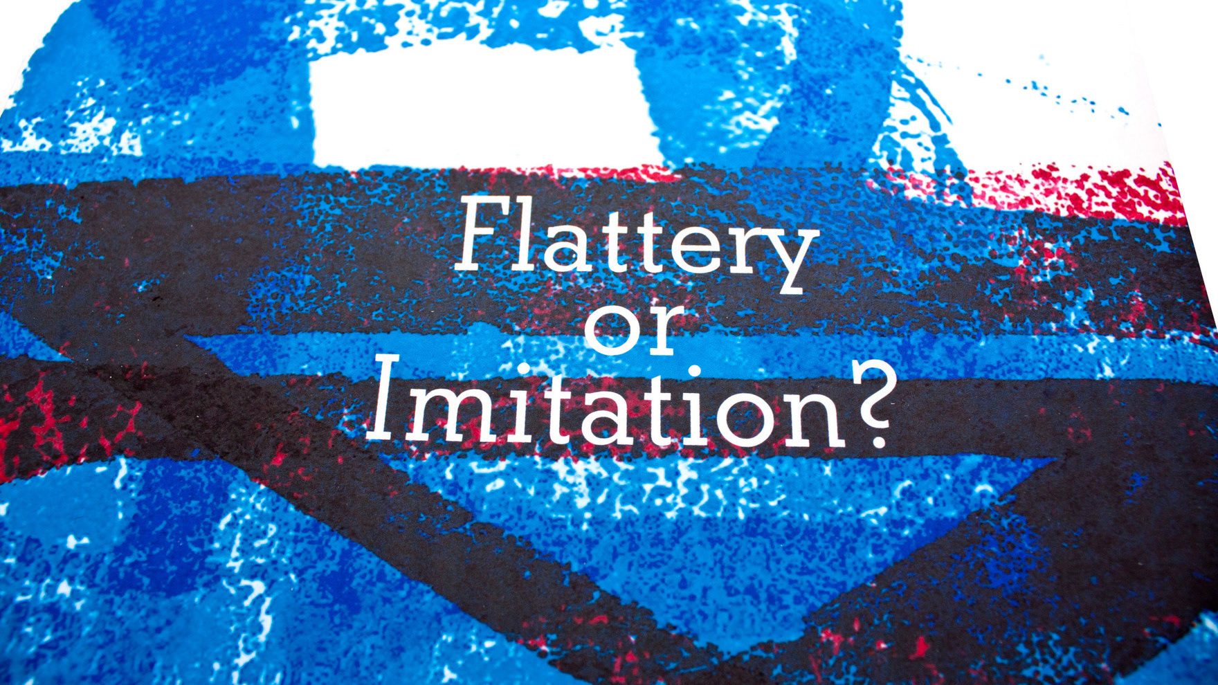
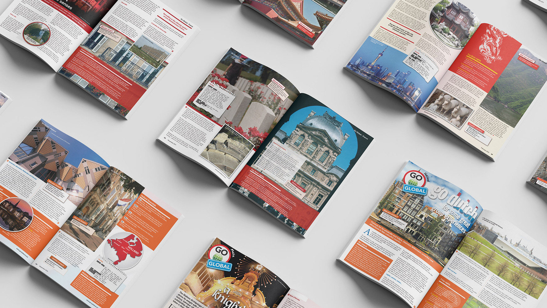
When I first looked into typography I could only find books that I would consider to be concrete blocks of wall to wall text and history. Whilst this itself is not exactly a bad thing, it didn’t exactly inspire someone when you’re flicking through the pages in your local university book store. Any other book would have paintings or photographs to illustrate the beauty of the text. So, as one of my projects I took it upon myself to correct that problem. I pictured college-me, who hated typography and thought it was boring and made that version of myself my audience.
I stuck to CMYK colours only and looked at history of typefaces as well as influential typographic artists such as David Carson, Paula Scher and Michael Bierut. The book was to come as a package with a sketchbook with dotted, lined and gridded paper to encourage and inspire new designers to pick up a pen or pencil and dive into the glorious world of typography.

